Build a better retention shortlist
S-Mobile · Churn prediction and probability calibration

A retention team has limited capacity. It needs to know where to look first, how much to trust a risk estimate, and what evidence would justify spending money on an offer. The S-Mobile case connects those decisions to a churn model trained on a deliberately oversampled dataset.
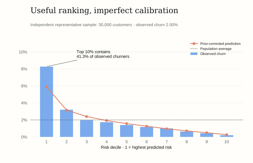
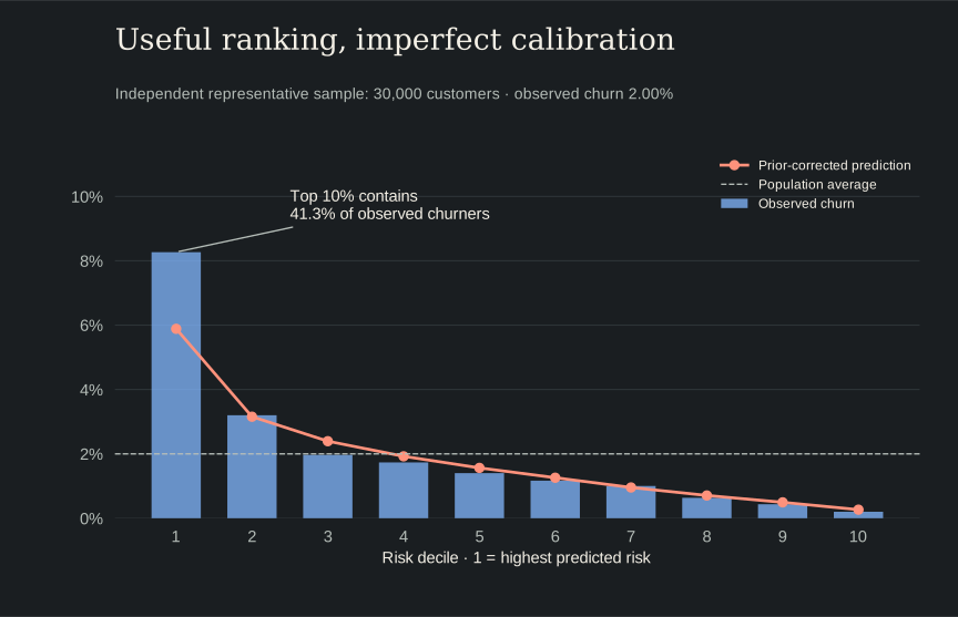
The central result is useful but specific: in an independent representative sample, the highest-risk 10% of customers contained 41.3% of observed churners. That supports a focused review queue. It does not establish that a particular retention offer would keep those customers.
The data creates a probability problem
The case separates customers into three non-overlapping samples:
| Sample | Customers | Churn rate | Purpose |
|---|---|---|---|
| Training | 27,300 | 50% | Fit the models |
| Test | 11,700 | 50% | Compare predictive ranking |
| Representative | 30,000 | 2% | Check behavior at the population base rate |
The training sample makes churners easier to learn from by giving them much more representation than they have in the business. But a model trained on a 50% churn rate cannot have its raw probabilities interpreted as population risk without adjustment.
The predictors cover usage, billing, handset age, customer tenure, and customer characteristics. Skewed usage measures receive log transformations. Revenue and usage changes can be negative, so the original analysis also uses sign-preserving transformations. Customer identifiers and the sample-assignment fields are excluded from the predictors.
Compare models on the same holdout
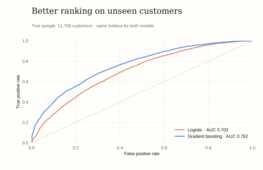
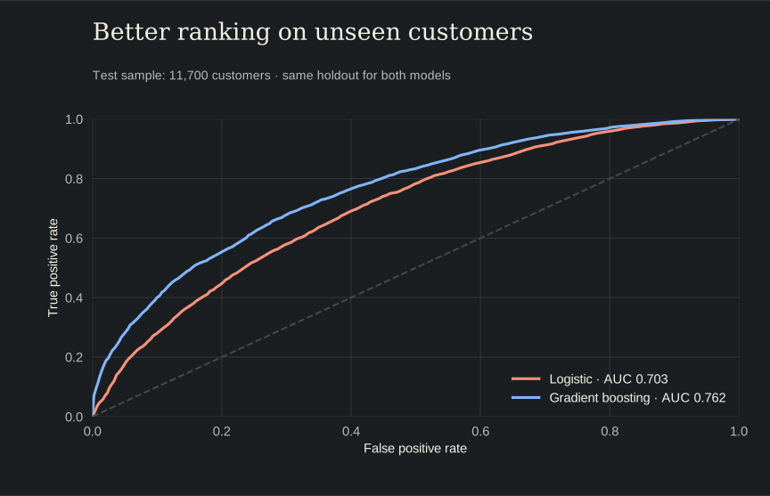
The reproduced logistic model achieved 0.703 test AUC. Gradient boosting achieved 0.762, using the original notebook’s 300-tree configuration. AUC measures ranking across churners and non-churners; it does not tell us whether a reported 10% risk occurs 10% of the time.
GradientBoostingClassifier(
    n_estimators=300,
    max_depth=4,
    learning_rate=0.05,
    subsample=0.8,
    random_state=42,
)
This is the model configuration from the source notebook. Shallow trees allow nonlinear relationships and interactions, while the learning rate controls each tree’s contribution. Both models use the same supplied training/test split; the representative sample is reserved for a separate check.
Put the scores back on the business scale
The original notebook applies a prior correction to the odds. It rescales from the sampled churn prevalence to the 2% population prevalence:
odds_correction = (p_true / (1 - p_true)) / (p_sample / (1 - p_sample))
odds_raw = p_raw / (1 - p_raw + 1e-12)
odds_calib = odds_raw * odds_correction
return odds_calib / (1 + odds_calib)
These lines come from the source calibrate function. With p_true = 0.02 and p_sample = 0.50, a raw prediction of 50% becomes 2%, and a raw prediction of 70% becomes about 4.55%. The transformation preserves ranking, so it does not improve AUC by itself.
On the representative sample, the boosting model’s average raw prediction was 40.91%. After correction it was 1.86%, much closer to the observed 2.00%. This adjustment assumes that sampling changed class prevalence without changing the within-class feature relationships.
The decile view reveals what the average hides. In the highest-risk group, the corrected average prediction was 5.89%, while observed churn was 8.27%. Correcting the prior makes the overall scale more useful, but it does not fully calibrate the high-risk tail.
A practical shortlist, with a measurable limit
The highest-risk decile contained 248 of the sample’s 600 churners. Its 8.27% churn rate is 4.13 times the population average. A team able to review 3,000 accounts would therefore find a much higher concentration of churn risk than in a random list of the same size.
That is a ranking result, not a treatment-effect estimate. The right next step is to test retention actions within the shortlist, including a control group, and compare incremental retained value with offer and service costs. An account can be likely to leave yet unresponsive to the proposed offer.
The original notebook also explores changing feature values and recalculating predictions. Those exercises can generate hypotheses, but setting “handset age” or “retention calls” to a different number in a dataset is not the same as observing a successful intervention. This case study therefore uses the validated risk concentration as its headline result rather than reporting simulated “churns prevented.”
What drives the ranking?
Handset age, overage minutes, and customer tenure carry the strongest predictive signals in the permutation check. Shuffling handset age reduces test AUC by approximately 0.122, larger than the drop for the other individual inputs shown below.
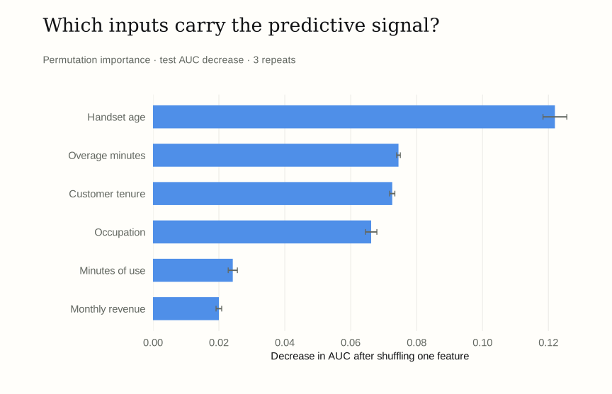
These results give a retention analyst a place to investigate service experience and account history. They do not imply that removing a recorded symptom will remove its underlying cause. The model helps prioritize questions; an experiment is still needed to establish which actions pay off.
Reproduction notes
This is a UC San Diego Rady course case, reproduced from s-mobile.ipynb in mgta455-s-mobile-Group-6 (source snapshot b91584a). Figures were regenerated from the supplied data; amounts described as expected or projected are model outputs, not realized company results.
The reproduction retains the original split and boosting settings. It removes an unsupported freq_weights argument from statsmodels Logit and applies the prior correction once. The local boosting AUC differs from the saved notebook output by about 0.0002; displayed results use the new run. Permutation importance uses three repeats rather than the notebook’s ten. The dataset contains observed churn, but no randomized retention-treatment outcome.
The reproduction exports aggregate results only. The data files remain in the original course repository. The downloadable script accepts a local repository path; it does not require the original Docker environment. The website itself uses the generated SVGs and does not retrain models during a build.
Aggregate results · Reproduction code · Figure code · Environment requirements